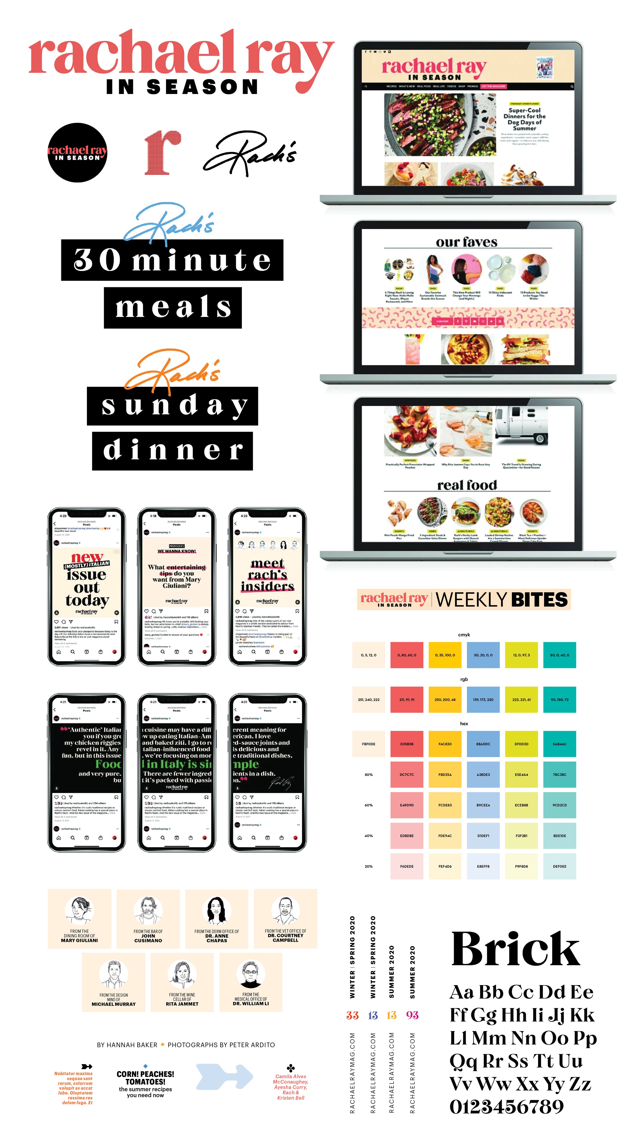
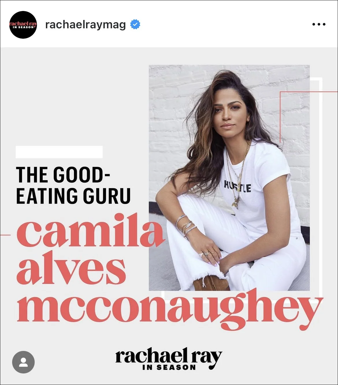
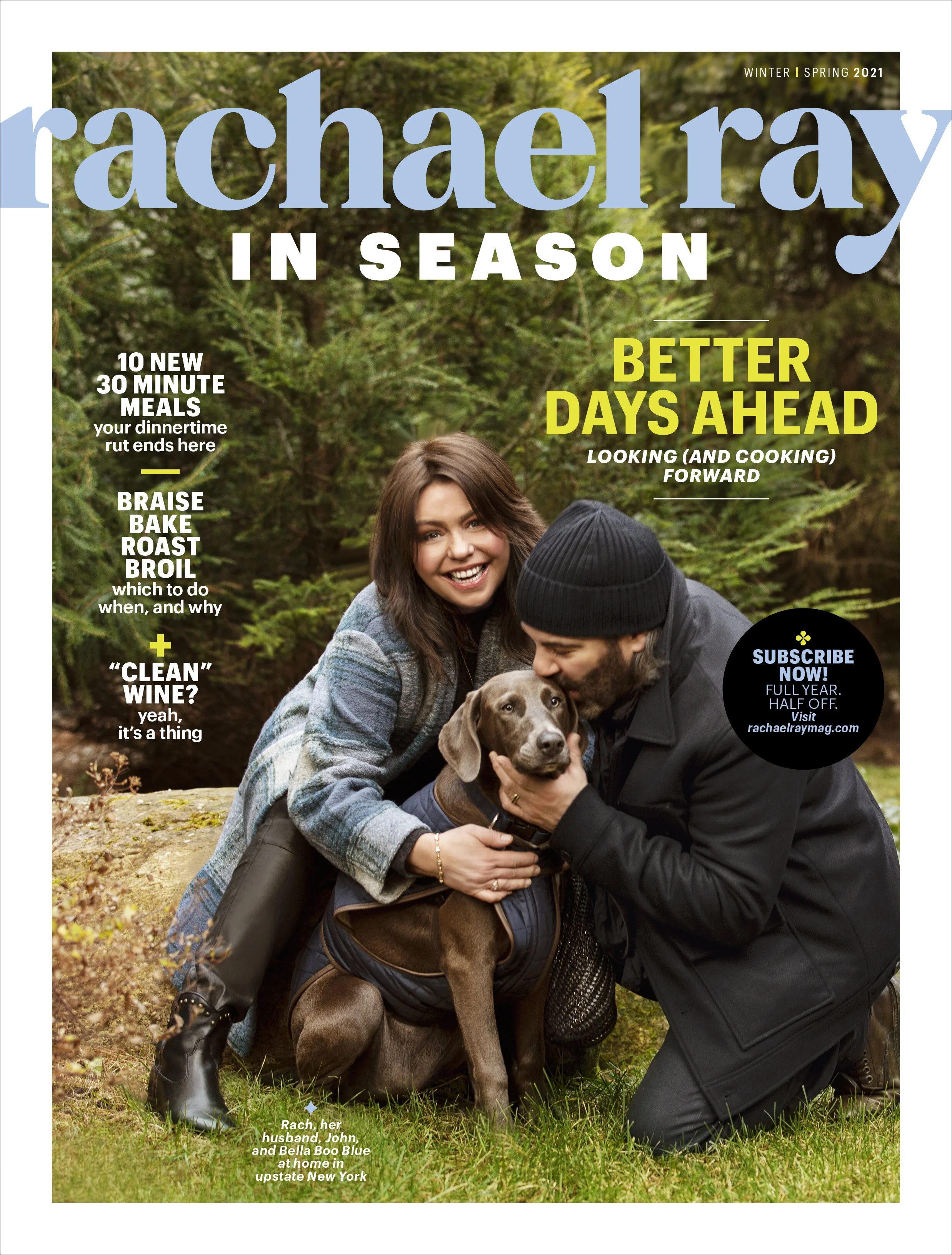
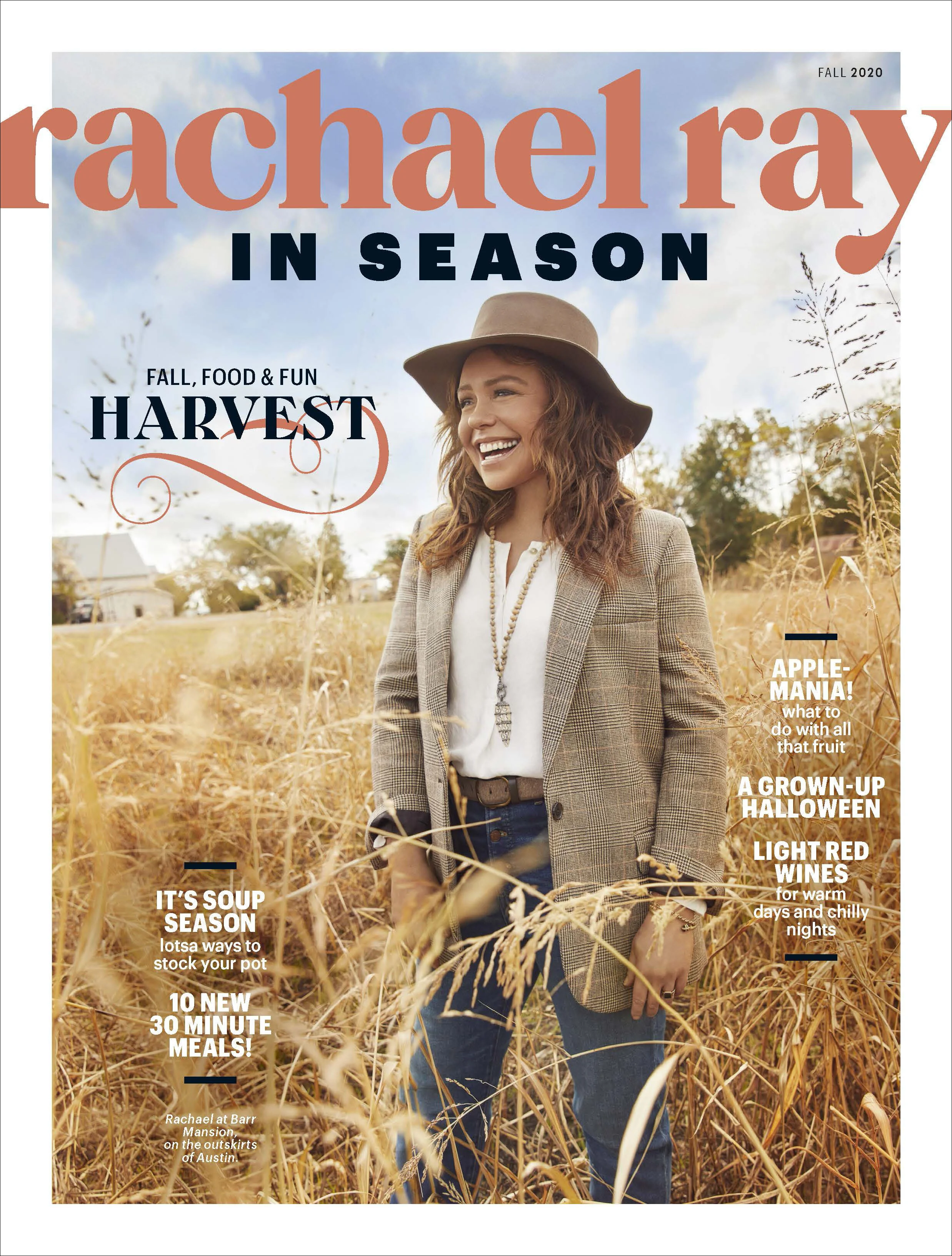
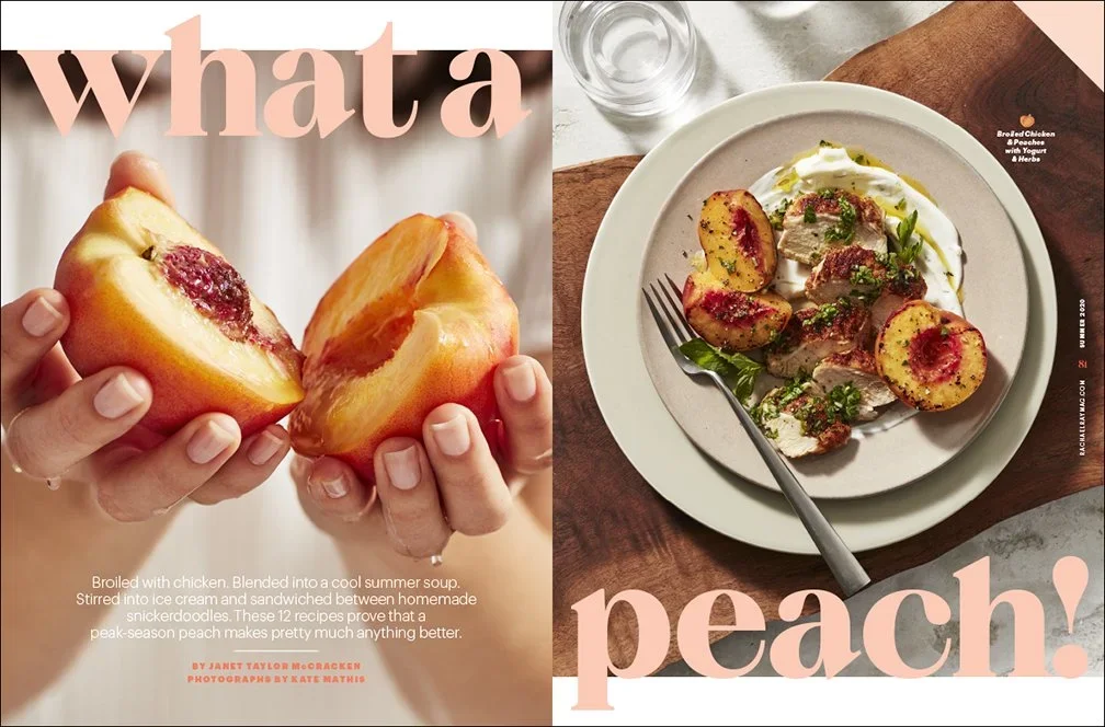
RACHAEL RAY IN SEASON
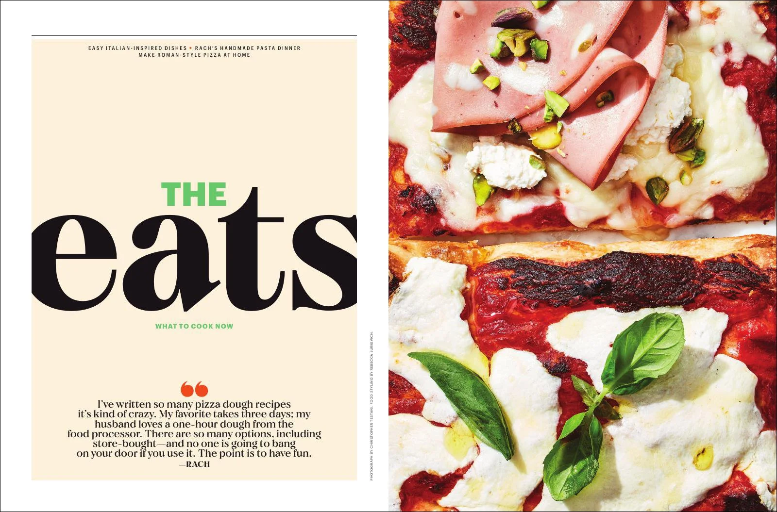
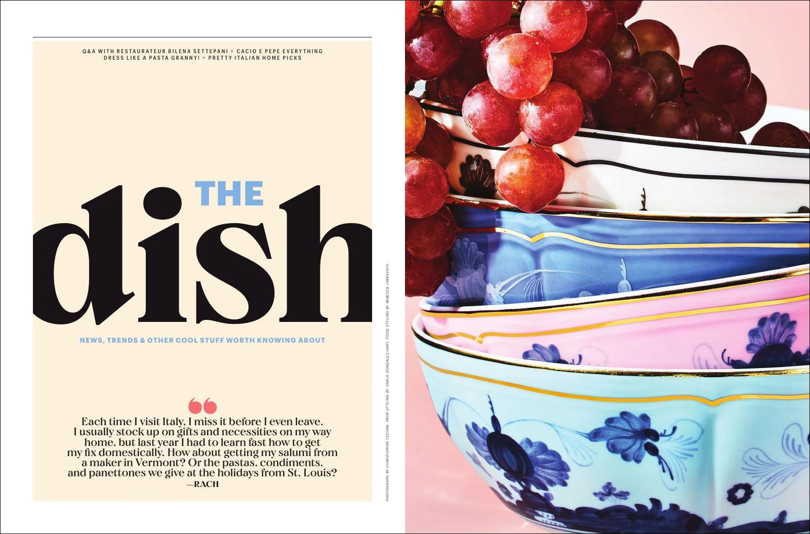
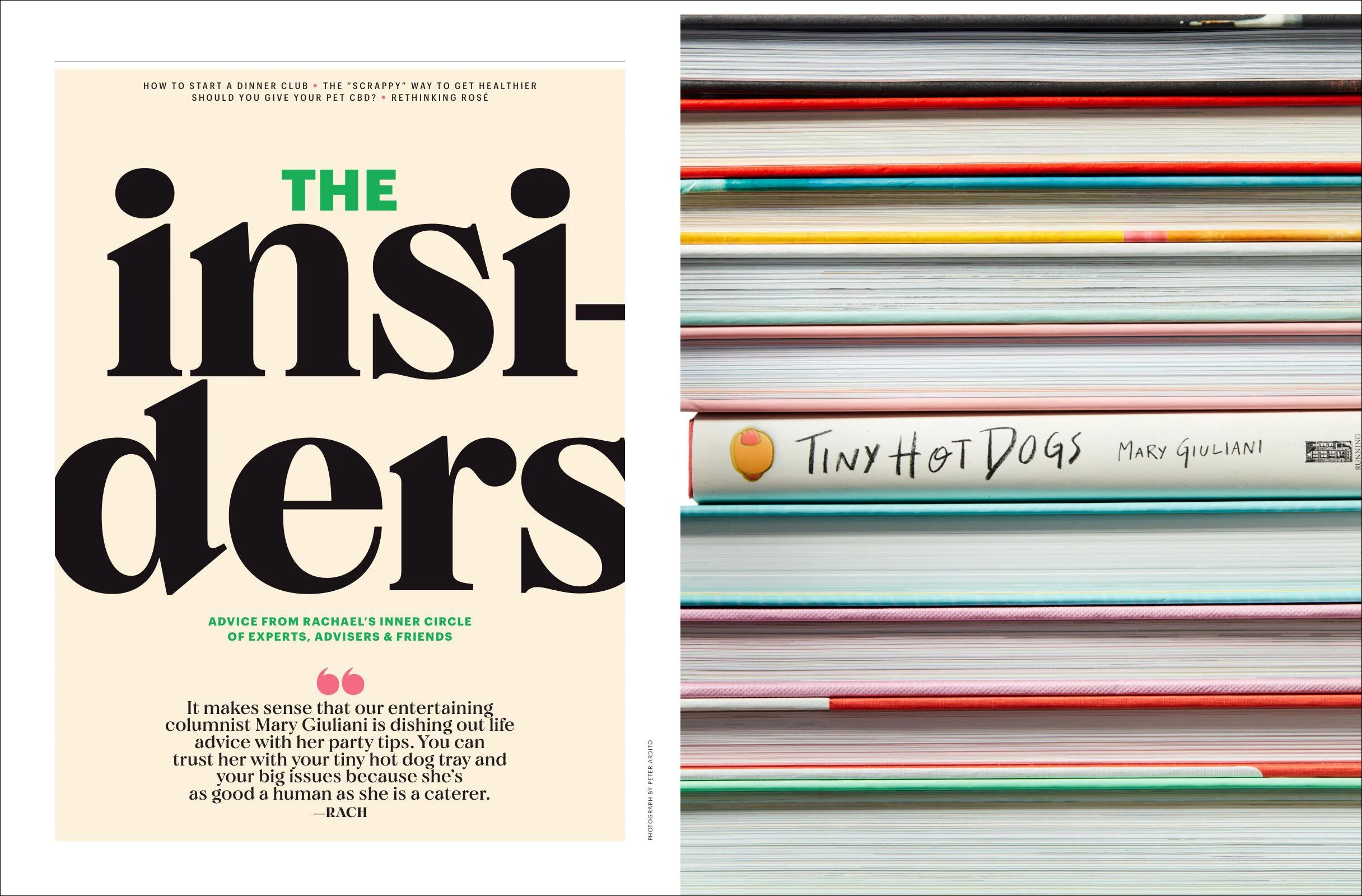
Leading the rebrand of Rachael Ray EveryDay to Rachael Ray In Season involved reimagining its identity to a premium, design-forward, bespoke multi-platform publication aligned with evolving audience tastes. Redesigned to reduce costs by 67%, while maintaining audience loyalty, the new look embraced bold type and incorporated seasonal imagery with a cohesive color palette. Story sections were determined by Rachael’s lifestyle and highlighted her friends, recipes, and personal tastes. Custom animated gifs and videos (including a series of step-by-step cooking instructions) peppered the brand’s social feed and website. A unified color palette with branded fonts and custom hand-lettering were kept consistent cross-platform. And the quarterly print magazine changed to a high-quality paper stock for a luxury feel.